Underbelly Festival
Client
About
University Third
Year Project
+ Brand Identity
+ Flexible Identity
+ Merch Design
My rationale behind this project is fundamentally simple. I drew inspiration from the knowledge that the location for my
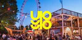
festival, Cavendish Square, is in fact not a square, but a circle compromised of four quarters. This gave me my basic assets in the form of a simple square and circle. From these two shapes, I comprised all of my design work, creating my eventual logo that represents the letters ‘U’ and ‘B’ in a geometric and obscure manner. The application therefore of my flexible identity is very easy to follow. So long as the elements that comprise the logo are all present regardless of the canvas dimensions, it fits within the identity. Pair this with the type and photography treatment and the identity itself comes to life quite easily with minimal application.


